Love And Money Gives Tame Impala's Orchid Synth a Blooming Identity
Love And Money created Orchid's fluid logotype and a compact custom typeface for the synthesizer's 128x128 display.
By Weston Deboer
October 6, 2026 · 2 min read
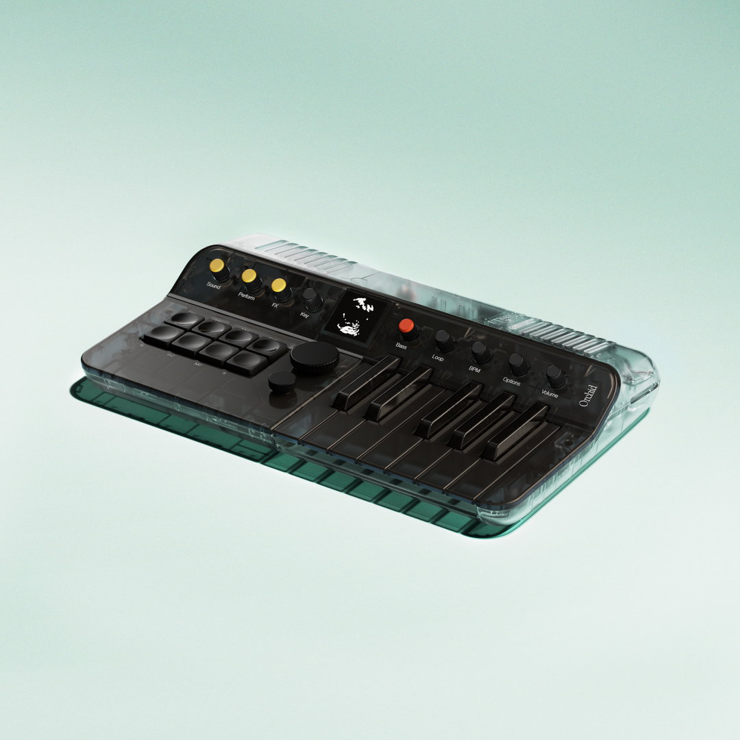
Love And Money, Orchid identity, 2026. Copyright Love And Money.
Telepathic Instruments' Orchid is designed to make harmony feel immediate. Co-founded by Tame Impala's Kevin Parker, the company built the compact instrument so a single button can voice a full chord. Its visual identity follows the same invitation: playful enough for a first encounter, but considered enough to reward musicians who stay with it.
Design consultancy Love And Money developed the brand alongside the physical product, led by industrial designer Ignacio Germade. The result connects an electronic instrument to a softer world of flowers, movement, and celestial imagery without losing the clarity a music tool demands.
A logo that blooms and decays
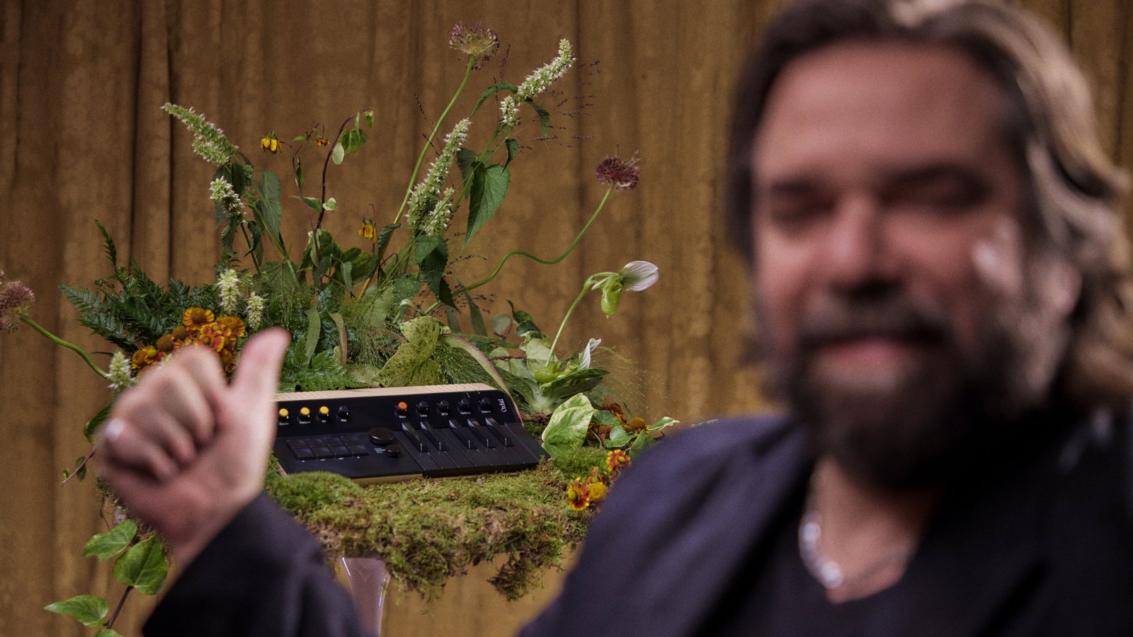
The Orchid wordmark began with Pangram Pangram's PP Editorial Neue, then moved away from an off-the-shelf setting through custom-drawn connections and softened, bleeding forms. Its letters appear to grow into one another. Depending on the moment, the mark can suggest a flower opening or an image beginning to dissolve, an apt visual parallel for a synthesizer note as it swells and fades.
That tension between the recognizable and the unfamiliar carries throughout the art direction. Nature gives the brand warmth and tactility, while haze, reflections, and luminous details push it toward something more dreamlike. The system feels connected to Parker's psychedelic music without simply borrowing a record sleeve's visual language.
Typography at 128 by 128 pixels
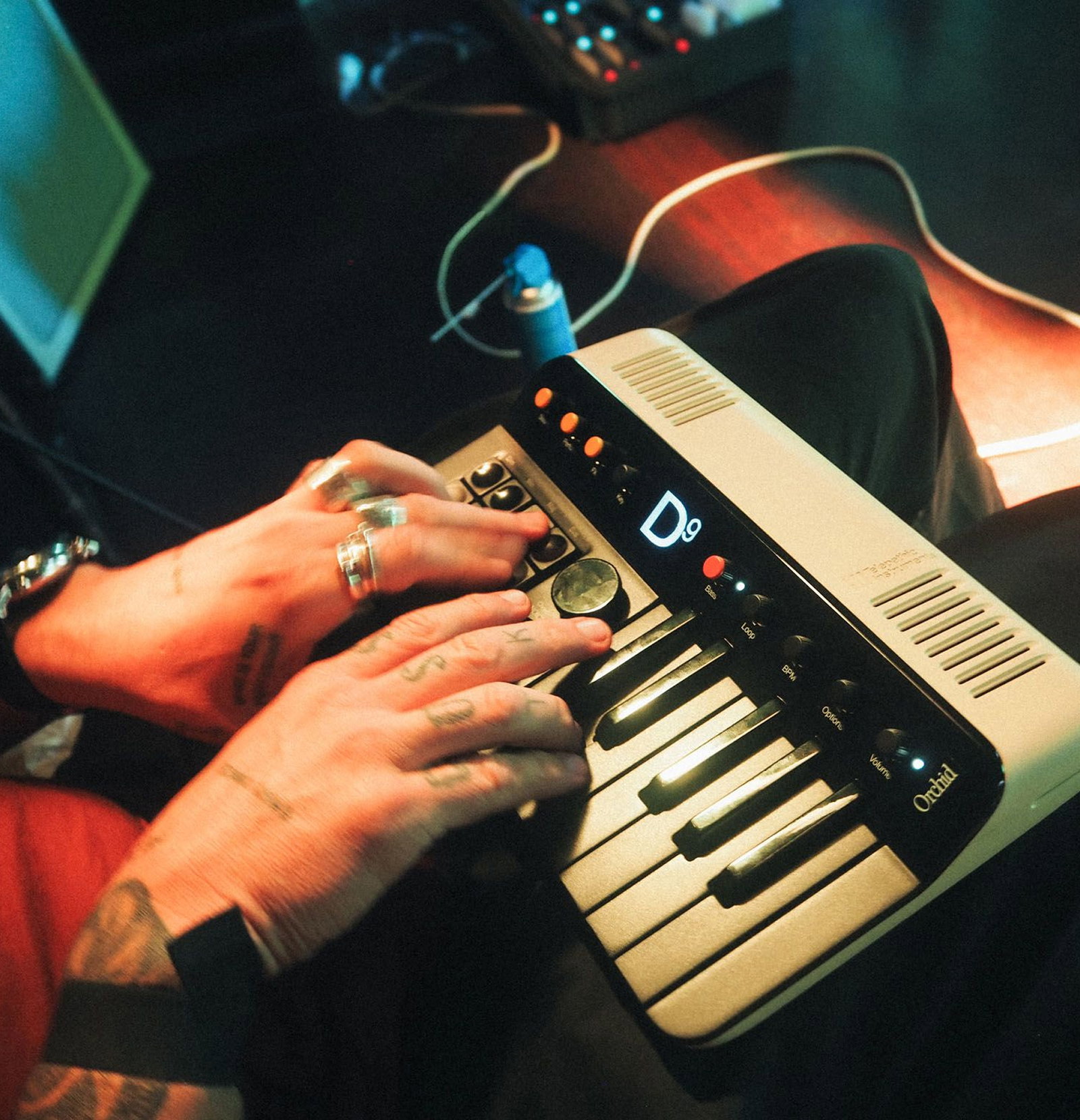
The smallest part of the identity may have required the tightest rules. Orchid's screen measures just 128 by 128 pixels, so Love And Money drew a dedicated display typeface called Chunky Roll. Once spacing was accounted for, most characters had to fit within roughly 14 to 18 pixels of height.
The typeface uses pixels that are two units high and one unit wide. That proportion keeps counters open at tiny sizes and leaves room for two distinct weights, giving the interface enough hierarchy to name chords, show settings, and animate transitions without becoming visually crowded.
An early experiment helped set the project's direction: Parker programmed a 1970s analog oscilloscope to draw a flower from an audio signal. Orchid's finished identity preserves that meeting point between signal and bloom, translating it across packaging, photography, the instrument itself, and the few pixels available on its screen.
Explore Telepathic Instruments, see more work from Love And Money, and read the full story at It's Nice That.
All images: Love And Money, Orchid, 2026. Copyright Love And Money. Used for editorial coverage.